【WPF】はてなアイコンを設置してツールチップでヘルプを表示する


今回はツールチップによってヒントを表示するサンプルです。
本当は何も説明しなくてもいいユーザーインターフェースを目指すべきなんですが、なかなかそうもいかない場合もありますよね。
まあプラスアルファで付けるとそれはそれで喜ばれるものかもしれません。
プログラムは前回のものを流用します。
【WPF】データグリッドにコンボボックスを表示する
画面の修正
MainWindow.xaml
<Mah:MetroWindow x:Class="WpfApp1.MainWindow"
        xmlns="http://schemas.microsoft.com/winfx/2006/xaml/presentation"
        xmlns:x="http://schemas.microsoft.com/winfx/2006/xaml"
        xmlns:d="http://schemas.microsoft.com/expression/blend/2008"
        xmlns:mc="http://schemas.openxmlformats.org/markup-compatibility/2006"
        xmlns:local="clr-namespace:WpfApp1"
        xmlns:Mah="clr-namespace:MahApps.Metro.Controls;assembly=MahApps.Metro"
        xmlns:p="clr-namespace:WpfApp1.Properties"
        mc:Ignorable="d"
        Title="一覧" Height="350" Width="530"
        GlowBrush="{DynamicResource AccentColorBrush}"
        Icon="/WpfApp1;component/Resource/Cat.ico"
        BorderThickness="1"
        >
    <Window.Resources>
        <ResourceDictionary Source="/Style/StyleDic.xaml"/>
    </Window.Resources>
    <Grid Height="350" Width="530" Margin="0,1,-10,-33">
        <Grid.Resources>
            <local:KindConverter x:Key="KindConv"/>
        </Grid.Resources>
        <Rectangle x:Name="rec_overlay" Width="530" Height="330" Style="{StaticResource rec-overlay}" />
        <Mah:ProgressRing x:Name="loading_image" Style="{StaticResource pgr-normal}"/>
        <Label Content="名前:" Margin="10,10,0,0" Style="{StaticResource lb-normal}"/>
        <Image Margin="54,15,0,0" Style="{StaticResource img-question}">
            <ToolTipService.ToolTip>
                <TextBlock Style="{StaticResource tkb-tooltip}" Text="{x:Static p:Resources.TL001}"/>
            </ToolTipService.ToolTip>
        </Image>
        <TextBox x:Name="search_name" Margin="76,12,0,0" HorizontalAlignment="Left" VerticalAlignment="Top" Width="120"  Style="{StaticResource MetroTextBox}"/>
        <Label Content="種別:" Margin="201,10,0,0" Style="{StaticResource lb-normal}"/>
        <Image Margin="245,15,0,0" Style="{StaticResource img-question}">
            <ToolTipService.ToolTip>
                <TextBlock Style="{StaticResource tkb-tooltip}" Text="{x:Static p:Resources.TL002}"/>
            </ToolTipService.ToolTip>
        </Image>
        <ComboBox x:Name="search_kind" Margin="275,12,0,0" HorizontalAlignment="Left" VerticalAlignment="Top" Width="125"  Style="{StaticResource MetroComboBox}" SelectedIndex="0" />
        <Button x:Name="search_button" Content="検索" HorizontalAlignment="Left" Margin="432,12,0,0" VerticalAlignment="Top" Width="75"  Click="search_button_Click" Style="{DynamicResource SquareButtonStyle}"/>
        <DataGrid Name="dataGrid" HorizontalAlignment="Left" Margin="10,43,0,0" Width="497" Height="225" Style="{StaticResource grid-normal}" >
            <DataGrid.Columns>
                <DataGridTemplateColumn IsReadOnly="True" Header="選択" Width="50">
                    <DataGridTemplateColumn.CellTemplate>
                        <DataTemplate>
                            <CheckBox IsChecked="{Binding IsChecked, Mode=TwoWay, UpdateSourceTrigger=PropertyChanged}" HorizontalAlignment="Center" VerticalAlignment="Center" />
                        </DataTemplate>
                    </DataGridTemplateColumn.CellTemplate>
                </DataGridTemplateColumn>
                <DataGridTextColumn Binding="{Binding No}" ClipboardContentBinding="{x:Null}" Header="No" IsReadOnly="True" Width="40" />
                <DataGridTextColumn Binding="{Binding Name}" ClipboardContentBinding="{x:Null}" Header="名前" IsReadOnly="False" Width="80"/>
                <DataGridTemplateColumn IsReadOnly="True" Header="性別"  CellStyle="{StaticResource dgc-combo}" Width="50">
                    <DataGridTemplateColumn.CellTemplate>
                        <DataTemplate>
                            <ComboBox Name="cmbGender" ItemsSource="{Binding RelativeSource={RelativeSource Mode=FindAncestor, AncestorType={x:Type DataGrid}}, Path=DataContext.GenderList, Mode=TwoWay, UpdateSourceTrigger=PropertyChanged}"
                                      DisplayMemberPath="Name" SelectedValuePath="Cd" SelectedValue="{Binding Sex}" Width="50" Background="Transparent"/>
                        </DataTemplate>
                    </DataGridTemplateColumn.CellTemplate>
                </DataGridTemplateColumn>
                <DataGridTextColumn Binding="{Binding Age, StringFormat=59:59}" ClipboardContentBinding="{x:Null}" Header="年齢" IsReadOnly="False" Width="40"/>
                <DataGridTemplateColumn IsReadOnly="True" Header="種別"  CellStyle="{StaticResource dgc-combo}" Width="110">
                    <DataGridTemplateColumn.CellTemplate>
                        <DataTemplate>
                            <ComboBox Name="cmbKind" ItemsSource="{Binding RelativeSource={RelativeSource Mode=FindAncestor, AncestorType={x:Type DataGrid}}, Path=DataContext.KindList, Mode=TwoWay, UpdateSourceTrigger=PropertyChanged}"
                                      DisplayMemberPath="KindName" SelectedValuePath="KindCd" SelectedValue="{Binding Kind}" Width="110" Background="Transparent"/>
                        </DataTemplate>
                    </DataGridTemplateColumn.CellTemplate>
                </DataGridTemplateColumn>
                <DataGridTextColumn Binding="{Binding Favorite}" ClipboardContentBinding="{x:Null}" Header="好物" IsReadOnly="False" Width="*"/>
            </DataGrid.Columns>
        </DataGrid>
        <Button x:Name="add_button" Content="追加" HorizontalAlignment="Left" Margin="10,273,0,0" VerticalAlignment="Top" Width="75" Height="30" Click="add_button_Click" Style="{DynamicResource AccentedSquareButtonStyle}"/>
        <Button x:Name="upd_button" Content="更新" HorizontalAlignment="Left" Margin="90,273,0,0" VerticalAlignment="Top" Width="75" Height="30" Click="upd_button_Click" Style="{DynamicResource AccentedSquareButtonStyle}"/>
        <Button x:Name="del_button" Content="削除" HorizontalAlignment="Left" Margin="170,273,0,0" VerticalAlignment="Top" Width="75" Height="30" Click="del_button_Click" Style="{DynamicResource AccentedSquareButtonStyle}"/>
        <Button x:Name="imp_button" Content="CSV読込" HorizontalAlignment="Left" Margin="250,273,0,0" VerticalAlignment="Top" Width="75" Height="30" Click="imp_button_Click" Style="{DynamicResource AccentedSquareButtonStyle}"/>
        <Button x:Name="exp_button" Content="CSV出力" HorizontalAlignment="Left" Margin="330,273,0,0" VerticalAlignment="Top" Width="75" Height="30" Click="exp_button_Click" Style="{DynamicResource AccentedSquareButtonStyle}"/>
        <Button x:Name="fld_button" Content="フォルダ参照" HorizontalAlignment="Left" Margin="410,273,0,0" VerticalAlignment="Top" Width="97" Height="30" Click="fld_button_Click" Style="{DynamicResource AccentedSquareButtonStyle}">
            <ToolTipService.ToolTip>
                <TextBlock Style="{StaticResource tkb-tooltip}" Text="{x:Static p:Resources.TL003}"/>
            </ToolTipService.ToolTip>
        </Button>
    </Grid>
</Mah:MetroWindow>
抜粋
        <Image Margin="54,15,0,0" Style="{StaticResource img-question}">
            <ToolTipService.ToolTip>
                <TextBlock Style="{StaticResource tkb-tooltip}" Text="{x:Static p:Resources.TL001}"/>
            </ToolTipService.ToolTip>
        </Image>
Imageタグの中に、ToolTipServiceのToolTipタグを入れ、更にテキストブロックでヒントを表示するようにしました。
また、文言自体はリソースファイルから取得するようになっています。
リソースを利用するために宣言部分に「xmlns:p」という属性を追加してあります。
画像の追加

スタイル定義の追加
StyleDic.xaml(抜粋)
        <!-- テキストブロック:通常 -->
        <Style x:Key="tkb-normal" TargetType="TextBlock">
            <Setter Property="VerticalAlignment" Value="Top" />
            <Setter Property="HorizontalAlignment" Value="Left" />
            <Setter Property="TextWrapping" Value="Wrap" />
            <Setter Property="FontSize" Value="14" />
        </Style>
        <Style x:Key="tkb-tooltip" TargetType="TextBlock" BasedOn="{StaticResource tkb-normal}">
            <Setter Property="Background" Value="#fefbdf" />
            <Setter Property="Padding" Value="3, 3, 3, 3" />
            <Setter Property="Margin" Value="0" />
        </Style>

        <!-- イメージツールチップ -->
        <Style x:Key="img-question" TargetType="Image">
            <Setter Property="Source" Value="/Resource/questionMark.png" />
            <Setter Property="VerticalAlignment" Value="Top" />
            <Setter Property="HorizontalAlignment" Value="Left" />
            <Setter Property="Height" Value="18" />
            <Setter Property="Width" Value="18" />
            <Setter Property="ToolTipService.ShowDuration" Value="30000" />
        </Style>
リソースの追加
ヒントで表示する文言をリソースに追加します。
Resources.resx
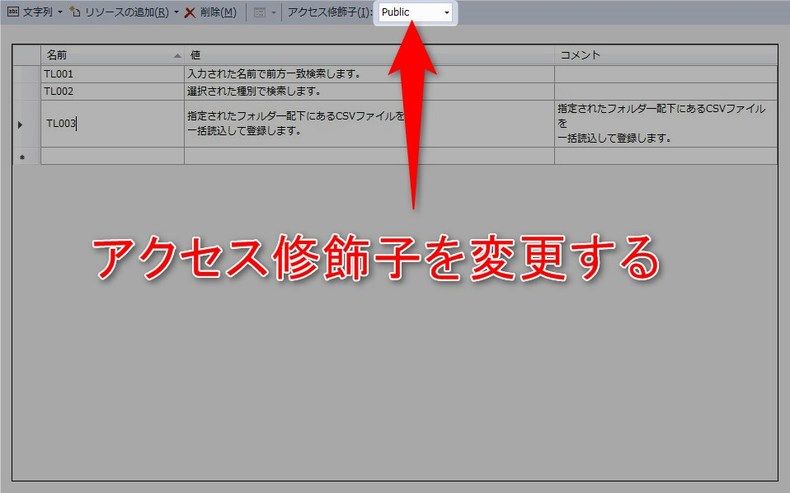
文言を追加し、xamlからアクセスするためにアクセス修飾子を「public」に変更します。
起動してみる
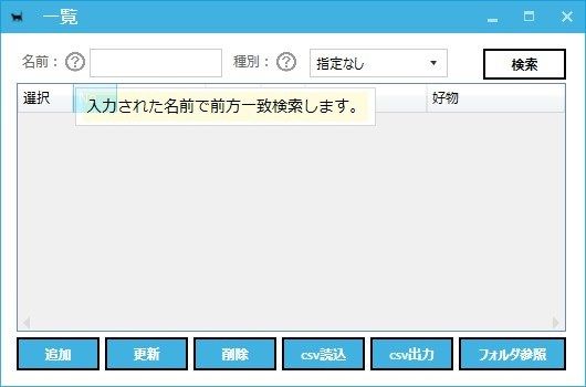
名前ラベルの横にあるハテナマークをマウスオーバーした表示です。
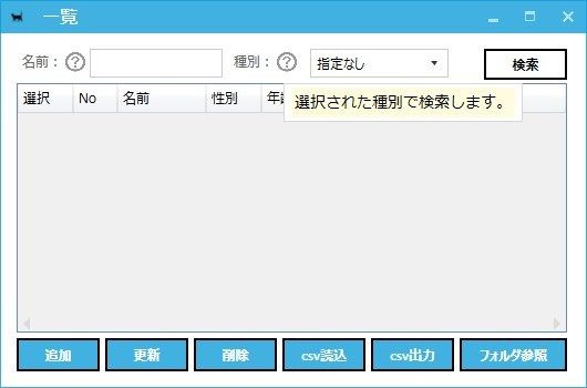
こちらは種別ラベルの横のハテナマークをマウスオーバーした表示となります。
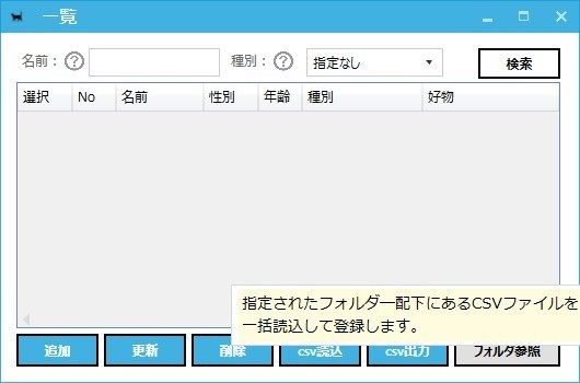
ついでにボタンにもつけてみました。
まとめ
簡単に実装できるうえ、スタイルを変更したり、表示時間を変更したりもできます。
表示するコンポーネントをテキストブロック以外にも出来そうなので、カスタマイズ性抜群ですね。
興味のある方は色々試してみてください。
ではでは。

IT関係の仕事をしています/1985年生まれの東京在住/便利なサービスやツール漁りや料理などが好き/2017年~ブログやってます/自分でサービスとか作ってリリースしたい/何かありましたらお気軽にDMどうぞ
Crieitは誰でも投稿できるサービスです。 是非記事の投稿をお願いします。どんな軽い内容でも投稿できます。
また、「こんな記事が読みたいけど見つからない!」という方は是非記事投稿リクエストボードへ!
こじんまりと作業ログやメモ、進捗を書き残しておきたい方はボード機能をご利用ください。
ボードとは?
コメント